Hi, I’m Ashbel. I'm a Senior Brand and Product Designer with 8+ years of experience turning complex problems into clear, engaging systems. I’ve designed for EA, Amazon, and Square across sports, gaming, tech, and e-commerce.
Featured Projects
2020-2025

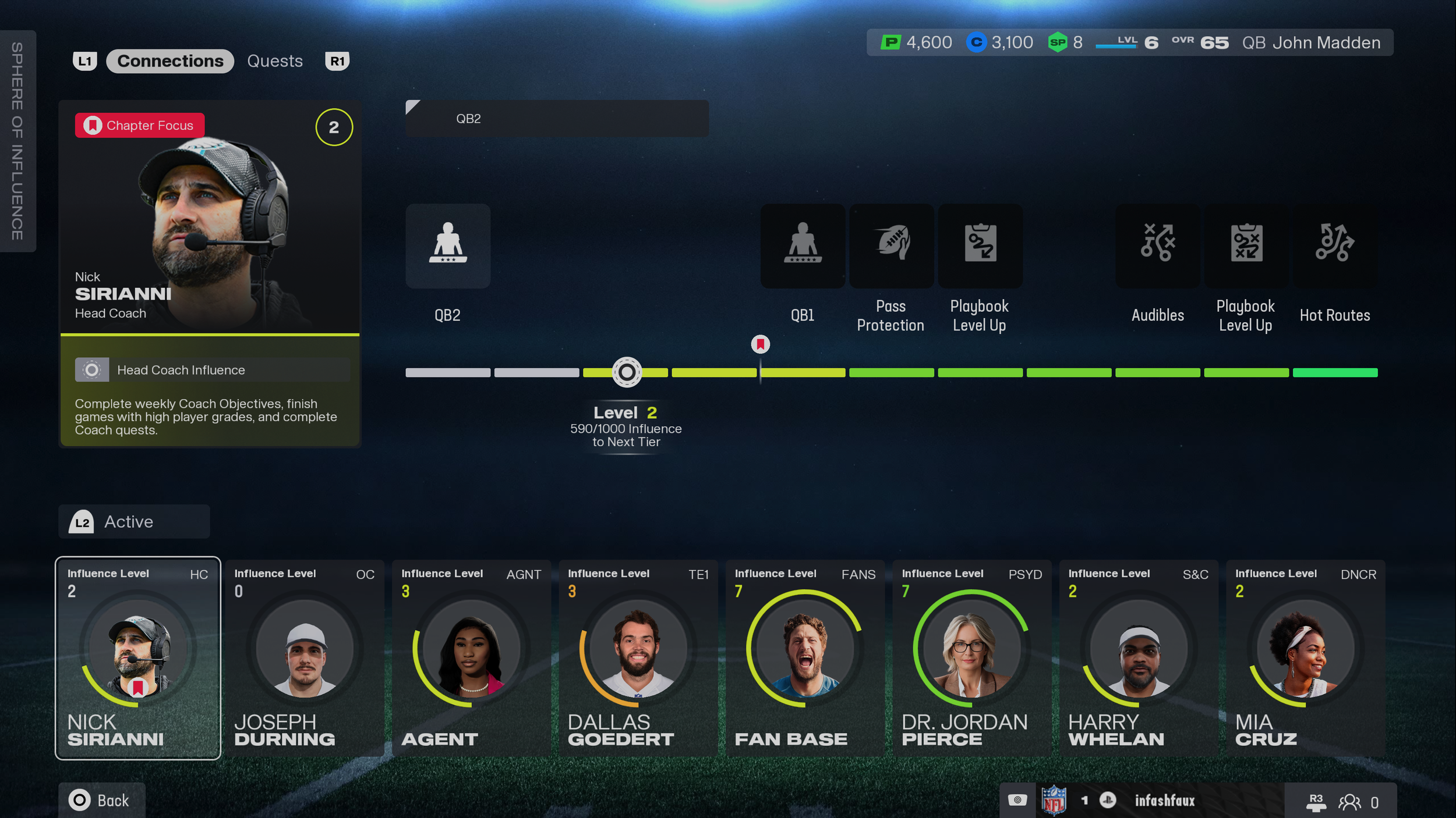
Madden 26 Superstar
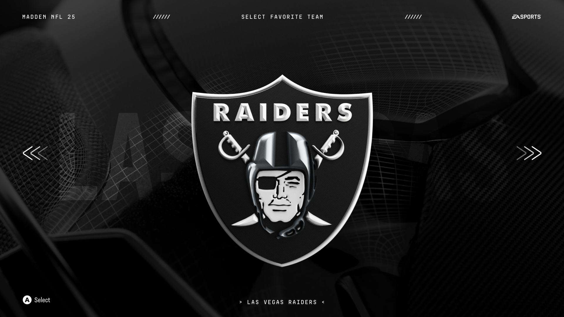
Madden 25 Boot Flow
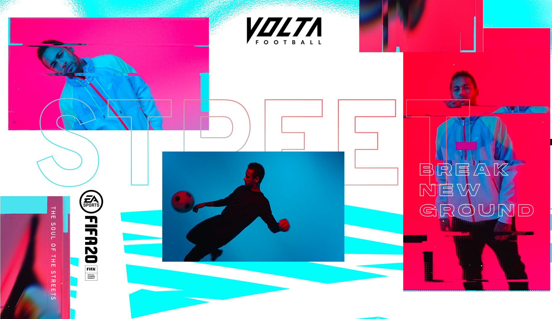
FIFA 20 x Volta Football
Square Marketing Page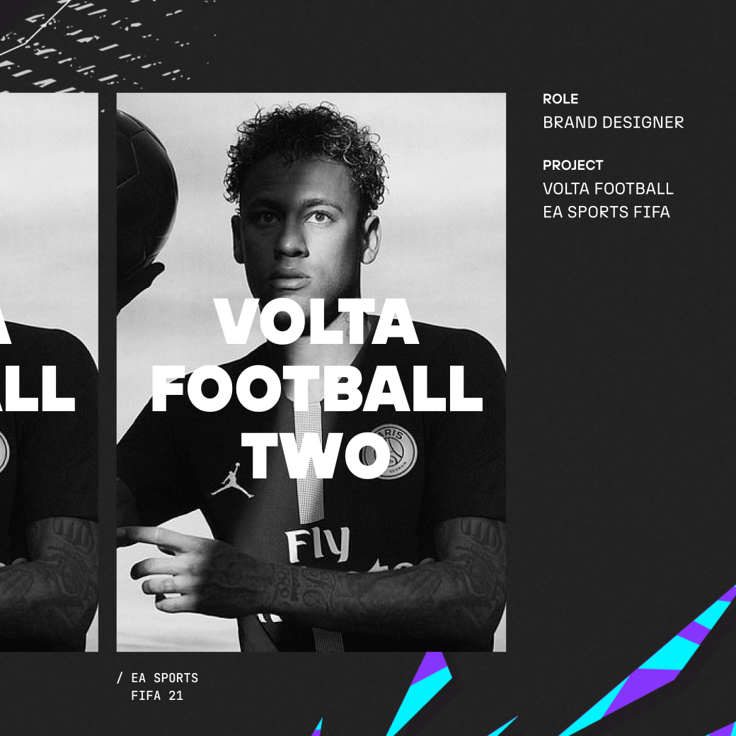
FIFA 21 x Volta Football
FIFA 21 x Influencer Book
2017 - 2020 Projects
Amazon Holiday Toy Book 2023